
Emily Kantz, Sherwin-Williams healthcare and hospitality color specialist, shares her expertise on the latest color trends and their uses in today’s healthcare facilities.
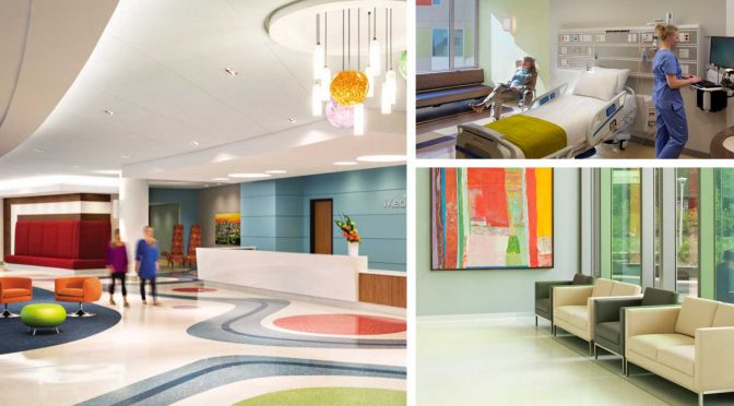
“Healthcare colors are going more toward more citrus tones,” Kantz says. “The pops of these citrus tones like greens, yellows, oranges just look so refreshing. And, they pair well with wood tones, which are always prevalent in the healthcare industry.”
Pastel color choices are trending “a little softer,” Kantz says. Blues and other natural-looking colors are always relevant in the healthcare market.
So long, clinical look!
In general, Kantz says, facilities are looking to get away from an institutional look.
“People want color, people want things that remind them of nature,” she says. “Color can act as a great visual cue without having all this graphic signage that can kind of get muddled in with the design.”
More resources
Sherwin-Williams has developed special interior paint color palettes for two healthcare sub-segments, including acute healthcare and senior living healthcare. Check them out at the Sherwin-Williams website.
For more color tools, resources, ideas and stories, visit the Sherwin-Williams painting contractor website.