From vivid blue and digital green, to high-def yellow and rusty auburn, the Sherwin-Williams 2018 Colormix Color Forecast exhibits three unique color palettes that draw from emerging global trends.
The collection predicts the colors that will drive conversation and inspiration for the coming year, offering new perspectives on societal influences and their impact on color and design trends.
By Sue Wadden
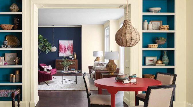
Colors to encourage community connections
For this year’s forecast, our color team at Sherwin-Williams identified 36 colors drawing from fashion, nature, pop culture and global design to create our three new Colormix palettes: Sincerity, Unity and Connectivity.
Like blue meeting yellow to make green, every color in our 2018 forecast is a collision of influences with every palette bringing a new chance at community. The connection to experiences, thoughts or moments in time is an important facet to life which deeply influenced the color trends that are primed to take hold next year. We eagerly await to see how these trends will unfold in the creation of unique new spaces.
Here are our three Colormix 2018 palettes:
Sincerity
Less is more as we declutter and move possessions into the cloud. There is a growing need for minimalism, daily meditation and the concept of lagom – “just enough.”
Sincerity is about mindful living and creating an environment to disconnect and recharge. Soft, washed neutrals, greens and sanctuary pinks work together to create harmony.
The hushed tones of Sincerity play out in sand, complex grays and hazy botanicals. There are no harsh lines, but rather, blending and fluid movements that create peace and space.
See the 12 colors in the Sincerity palette
Unity
We’re remapping our sense of community, landlocked cities are becoming global hubs of crafts and gastronomy. Home and car sharing, as well as e-learning, have created a culture of everyday nomadism and the wanderlust-obsessed.
The Unity palette reflects our need for roaming as we seek to make connections with new places and cultures, and the celebration of indigenous patterns and artisan crafts we find along the way.
The bright folklore of this story is told in memorable pops of peacock color, animated fuchsia and grounded browns.
See the 12 colors in the Unity palette
Connectivity
In Silicon Valley, Austin, Berlin and Beijing, techies are the new hippies, full of breakthrough ideas and utopian ideals.
Connectivity is modern and playful, bringing in dark watery tones of blue that are balanced with neutrals, warm yellow and energetic purples.
Inspired by the progressive movement of virtual reality, productivity and youth culture, the high-tech Connectivity palette serves up colors we crave: pixelated in orange, violets, digital greens and high-def yellow.
See the 12 colors in the Connectivity palette
This article was originally published in the Fall 2017 issue of PPC magazine and was written by Sue Wadden, Director of Color Marketing, Sherwin-Williams. You can find more color ideas, tools and resources at the Sherwin-Williams contractor website.