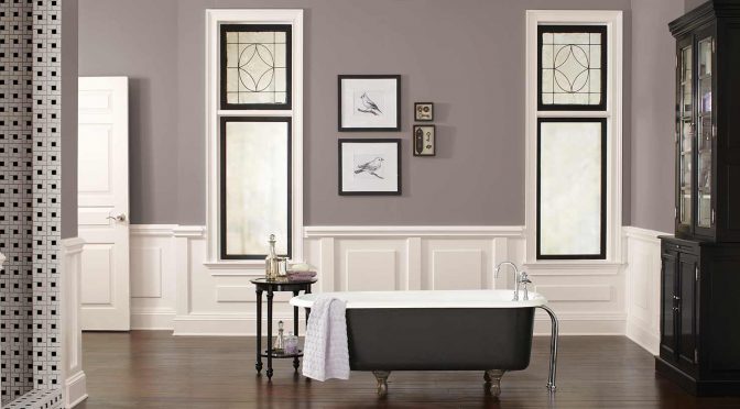
The “new” neutral, Poised Taupe (SW 6039) is classic yet modern and the perfect balance of warm and cool.
Satisfy your customers’ desire for beautiful neutrals
A modern take on a timeless classic, Poised Taupe signals a new direction in society’s ever-growing thirst for beautiful neutrals that bring warm and cool tones together to create one irresistibly versatile color.
“Poised Taupe celebrates everything people love about cool gray as a neutral, and also brings in the warmth of brown, taking a color to an entirely new level,” says Sue Wadden, director of color marketing for Sherwin-Williams. “Not cool or warm, nor gray or brown, Poised Taupe is a weathered, woodsy neutral bringing a sense of coziness and harmony that people are seeking,”
Trend: Warmer, more complex neutrals
As the Sherwin-Williams team traveled the world to identify the latest trends and make this year’s selection, it became clear that neutrals are beginning a transition from the monochrome gray of the past five years to a more complex taupe and brown.
In a recent homeowner survey conducted by Sherwin-Williams, nearly 40 percent of the respondents said they would like to incorporate warmer neutrals, such as warm grays, taupes or beiges, into their home décor. Additionally, more than two in five people identified taupe as a timeless neutral they would choose.
Drawn from the Noir palette, one of four palettes in the colormix 2017 forecast, Poised Taupe addresses the search for authentic spaces that recharge the spirit in uncertain times and where perfection can seem like the ideal.
“Consumers yearn for spaces that feel welcoming and hug them as they enter,” says Wadden. “Earthen brown combined with conservative gray, creating Poised Taupe, embodies all of these emotions.”
Perfect for commercial spaces too
The subtle shift to warmer colors reaches commercial spaces too, which tend to move in more conservative color cycles than residential or designer directions.
Influences such as natural or organic materials, weathered and worn finishes and global cultural preferences have suggested alternatives to the primarily gray existence that has been the star of commercial color direction over the past five years.
“Since commercial color direction tends to enjoy longer lifecycles, Poised Taupe is on the forefront of this trend, offering the ability to endure over time, yet complement a wide range of designs,” says Wadden.
Aligned with this burgeoning trend of moving away from the stark, cold and barren commercial environments, Poised Taupe is a warm color that offers dimension and complexity, but is neutral and subtle to work with for nearly all aesthetics.
What goes best with Poised Taupe? Sherwin-Williams color experts have selected three perfect pairings. Read more here. For all the latest color tools and resources, visit swcolorsnap.com.